![](https://cdn.myportfolio.com/9dce23a7-9f40-4a86-8ea1-2ee98604eaee/5d42f094-7880-4413-ab94-5f10ffcb6d67_rw_1200.png?h=da23865c7a6162afe62b61baff90c83e)
![](https://cdn.myportfolio.com/9dce23a7-9f40-4a86-8ea1-2ee98604eaee/81acba05-43ce-43d6-b110-19ea873733b8_rw_1200.png?h=0af25c5084b9ed4cb22460dd77dc6041)
![](https://cdn.myportfolio.com/9dce23a7-9f40-4a86-8ea1-2ee98604eaee/5f3738b3-2df6-44fd-b9a5-087dc5dd7f3a_rw_1920.png?h=9cf1b198fc4337c446f1b10dd3f315db)
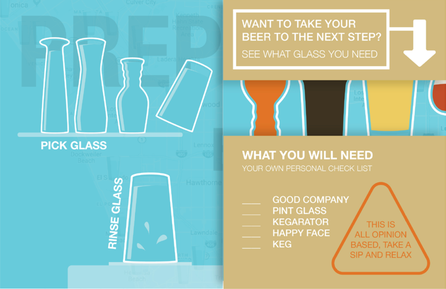
Once you open the pamphlet, the whole how to and then the back cover. I chose these colors because how fun and happy they make you feel. The sand color is contrasting the blue but also has a same qualities as the beer.
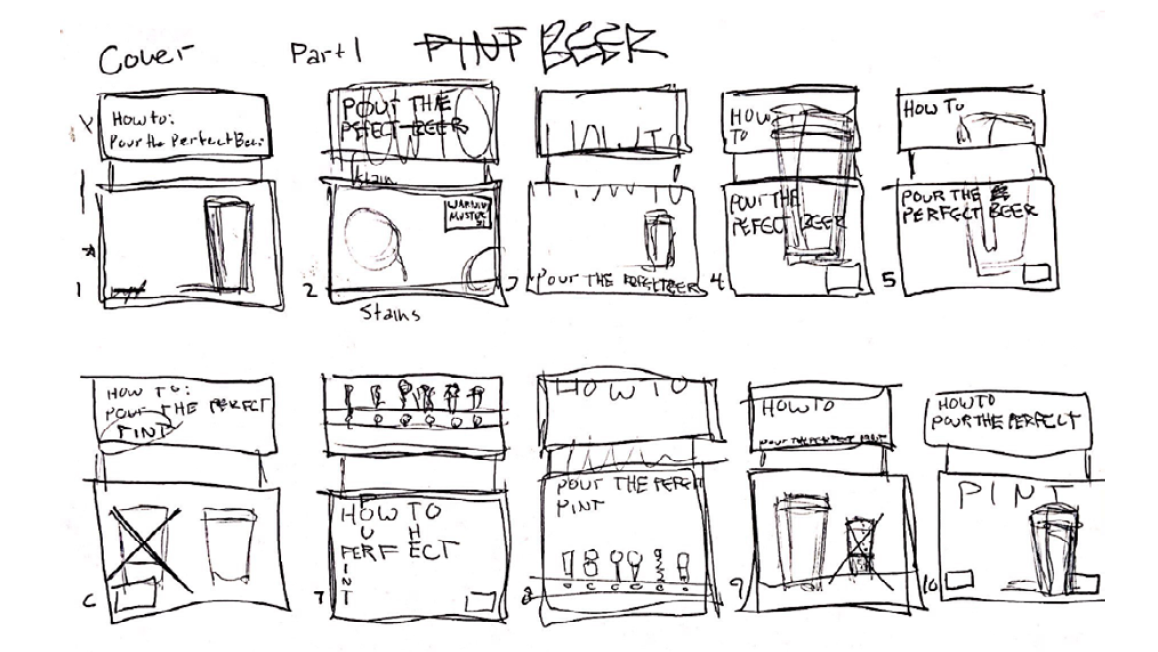
A designer’s composition should dictate the viewer experience and create a relationship between the viewer and the subject. I was tasked with designing a visual “How-To-Guide”. Emphasis should be on visuals with minimal text.